
文章阅读目录大纲
 https://github.com/rsharp-lang/ggplot
一张统计图形就是从数据到几何对象(geometric object, 缩写为geom, 包括点、线、条形等)的图形属性(aesthetic attributes, 缩写为aes, 包括颜色、形状、大小等)的一个映射。此外, 图形中还可能包含数据的统计变换(statistical transformation, 缩写为stats), 最后绘制在某个特定的坐标系(coordinate system, 缩写为coord)中, 而分面(facet, 指将绘图窗口划分为若干个子窗口)则可以用来生成数据中不同子集的图形。
----- Hadley Wickham
截至时间到2021年10月初,我已经基于VisualBasic语言实现了一个比较完整的在.NET Framework/.Net Core环境上运行的类R语言环境:R#脚本语言。在R#脚本语言之中进行绘图,之前任然会需要通过VisualBasic编写对应的绘图模块来完成,比较不是很方便。所以我在最近几天通过模仿R语言之中著名的ggplot程序包,为R#脚本语言也开发了一个功能上类似的绘图程序包。
R#
ggplot介绍
ggplot2是由Hadley Wickham创建的一个十分强大的可视化R包。按照ggplot2的绘图理念,Plot(图) = data(数据集) + Aesthetics(美学映射) + Geometry(几何对象)
- 数据(Data)和映射(Mapping)
- 几何对象(Geometric)
- 标尺(Scale)
- 统计变换(Statistics)
- 坐标系统(Coordinante)
- 图层(Layer)
- 分面(Facet)
- 主题(Theme)
在之前,上一个令我惊艳的数据可视化程序包,是一个通过perl脚本编写的用于可视化基因组数据的Circos程序:Circos程序之中也可以通过类似于ggplot的图层叠加的语法编写配置文件进行数据图表的绘制。而今天所介绍的ggplot程序包则是一个泛用性比Circos脚本更加高的数据可视化程序包。接下来我就分为几个篇幅的博文来为大家讲解在VisualBasic编程中是如何实现ggplot程序包上面的一些基本功能的。
请注意:
在R#语言之中的ggplot绘图程序包中,针对R语言之中的ggplot2绘图程序包做了一些在样式配置上的改进。在一些函数的使用方法上会出现与R语言之中的ggplot2程序包中的函数存在一些差异。例如在样式设置上,R#语言之中的赋值主要是基于HTML语言之中的CSS样式字符串表达式来完成的,这个特性会造成R#与R语言之中的ggplot样式调整代码之间在使用方法上存在比较大的差异。
ggplot基础结构
在R#语言的ggplot程序包之中,按照上面的8个基本要素,目前我为ggplot程序包添加了下面的一些基础元素模型:
- ggplot 对象,ggplot数据可视化作图的主框架
- ggplotLayer 对象,ggplot的数据可视化图层,例如散点图,直方图,连线图,箱式图等
- ggplotOption 对象,ggplot的样式调整参数选项对象,用于调整一些字体样式,字体大小等作图样式细节
- ggplotReader 对象,用于告诉ggplot对象如何读取原始数据进行ggplotLayer的创建
表达式的实现
Plot(图) = data(数据集) + Aesthetics(美学映射) + Geometry(几何对象)
我们通过学习使用ggplot过程中了解到,ggplot是通过加法运算来进行可视化图层的叠加以及样式调整等操作。那在R#语言之中是如何实现上面所示的一个加法运算过程的呢?如果你在之前已经读过了我的这篇博客文章《化学式符号运算》,那心中应该是存在有答案了的。我们在这里任然是通过使用ROperator
<ROperator("+")>
Public Function addLayer(ggplot As ggplot, layer As ggplotLayer) As ggplot
    ggplot.layers.Enqueue(layer)
    Return ggplot
End Function

<ROperator("+")>
Public Function configPlot(ggplot As ggplot, opts As ggplotOption) As ggplot
    Return opts.Config(ggplot)
End Function
上面的两个函数主要是实现了在ggplot的绘图表达式之中的数据可视化图层的叠加,以及对作图样式做细节调整的代码工作。基于类似于上面的两个函数,我们就可以在R#语言之中实现类似于R语言之中的ggplot2的加法运算的语法了。
一个简单的DEMO实现
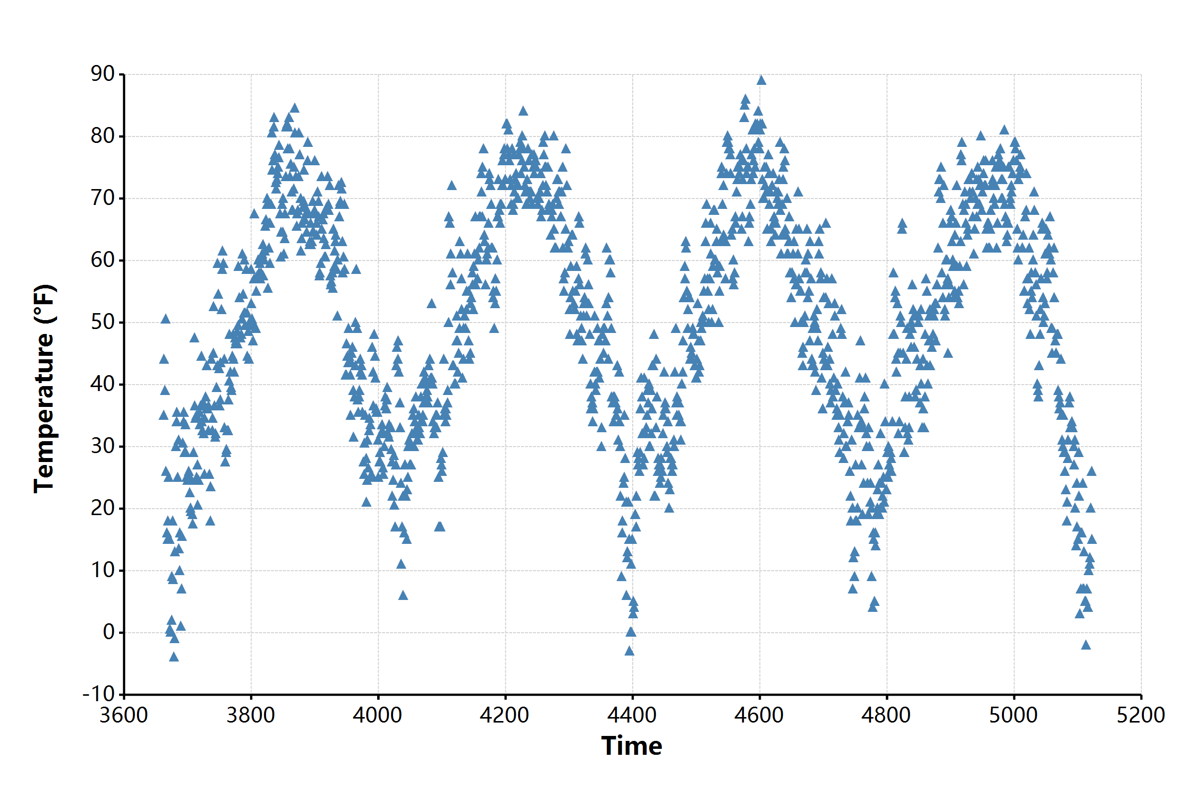
目前,我已经初步建立起了整个ggplot的数据可视化绘图的基础框架。详细的代码实现我们将会在后续的一些博客文章之中学习。在这里贴出一个比较简单的基于R#脚本语言之中的ggplot程序包进行散点图绘制的代码:
# loading packages
require(ggplot2);

# read source data
const chic <- read.csv(`${@dir}/chicago-nmmaps.csv`);
# peeks of the raw data
print(head(chic, 10));

#         city      date                   death      temp      dewpoint  pm10             o3           time       season    year
# <mode>  <string>  <<generic> DateTime>   <integer>  <double>  <double>  <string>         <double>     <integer>  <string>  <integer>
# [1, ]   "chic"    #1997-01-01 00:00:00#  137         36        37.5     "13.052268266"    5.6592562   3654       "Winter"  1997
# [2, ]   "chic"    #1997-01-02 00:00:00#  123         45        47.25    "41.948600221"    5.5254167   3655       "Winter"  1997
# [3, ]   "chic"    #1997-01-03 00:00:00#  127         40        38       "27.041750906"    6.2885479   3656       "Winter"  1997
# [4, ]   "chic"    #1997-01-04 00:00:00#  146         51.5      45.5     "25.072572963"    7.537758    3657       "Winter"  1997
# [5, ]   "chic"    #1997-01-05 00:00:00#  102         27        11.25    "15.343120765"    20.7607976  3658       "Winter"  1997
# [6, ]   "chic"    #1997-01-06 00:00:00#  127         17        5.75     "9.36465498"      14.9408742  3659       "Winter"  1997
# [7, ]   "chic"    #1997-01-07 00:00:00#  116         16        7        "20.228427832"    11.9209855  3660       "Winter"  1997
# [8, ]   "chic"    #1997-01-08 00:00:00#  118         19        17.75    "33.1348192868"   8.6784773   3661       "Winter"  1997
# [9, ]   "chic"    #1997-01-09 00:00:00#  148         26        24       "12.118380932"    13.3558919  3662       "Winter"  1997
# [10, ]  "chic"    #1997-01-10 00:00:00#  121         16        5.375    "24.761534146"    10.4482639  3663       "Winter"  1997

bitmap(file = `${@dir}/ggplot-demo.png`, size = [2400, 1600]) {
    # open graphics device and then do plot
    ggplot(chic, aes(x = "time", y = "temp"), padding = "padding:150px 100px 200px 250px;")
       + geom_point(color = "steelblue", shape = "Triangle", size = 21)
       + labs(x = "Time", y = "Temperature (°F)")
       + ggtitle("Temperatures in Chicago")
       + scale_x_continuous(labels = "F0")
       + scale_y_continuous(labels = "F0")
    ;
}
实现出来的作图效果可以看得到是非常好的:

教程文章列表
- 单细胞视角下的微生物基因组代谢酶嵌入分析 - 2026年2月25日
- 基因组代谢酶层级嵌入 - 2026年2月23日
- 基因组功能吉布斯LDA主题建模 - 2026年2月23日

3 Responses
很难找到, 这么高质量的内容。非常酷。
[…] 想了解关于ggplot的图层是如何工作的,大家可以阅读之前写的一篇博客文章: 【数据可视化】对ggplot程序包的从头实现 […]
[…] 【数据可视化】对ggplot程序包的从头实现 […]